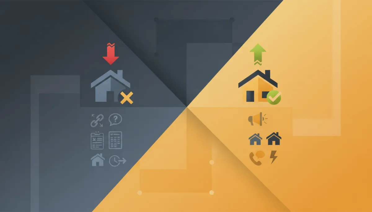
Real Estate Website Conversion: What to Fix First
Real Estate, Conversion
Why Most Real Estate Websites Don't Convert (And What to Fix First)
Most real estate websites fail to convert not because they lack traffic, but because they were built as digital brochures instead of conversion tools. They present the company, show some photos, and give a visitor who is ready to act no clear next step: no single obvious action, no reason to take it now, and a contact form that leads nowhere fast. The fix is rarely more ad spend or more SEO. It is rebuilding the page around one buyer, one message, and one action, with immediate follow-up the moment someone raises their hand.
Here is the misdiagnosis, the six mistakes behind it, and what to fix first.
The Misdiagnosis: "We Need More Traffic"
When inquiries are thin, the instinct is always the same: spend more on ads, push harder on SEO, get more visitors. The site itself is rarely suspected, because it looks fine. It has the logo, the photos, the pages.
Run the honest math instead. If a thousand visitors produce five inquiries, the site converts one in two hundred. Doubling traffic at that rate doubles your cost to get ten inquiries, and every future visitor you ever pay for arrives at the same leaky page. Sending more traffic to a page that does not convert just means paying more for the same disappointing result.
Fixing conversion works differently. Move that same page from five inquiries per thousand visitors to fifteen and every dollar of past and future traffic spend triples its output without a single new visitor. Conversion is the multiplier on everything upstream, which is why it is the thing to fix first, before scaling any traffic source.
The Six Mistakes We See on Almost Every Real Estate Site
1. No Clear Single Call to Action
Open the typical developer or brokerage homepage and count the competing asks: About Us, Our Projects, Services, News, Contact, social icons, a chat bubble, maybe a newsletter. Everything is clickable, so nothing is the point. A visitor with genuine intent is given a menu instead of a next step. Conversion-focused pages make one action unmistakably primary, such as "Register your interest" or "Book a viewing call," and everything else visually secondary.
2. Generic Corporate Messaging
"Excellence in real estate since 2005. Your trusted partner." This says nothing to anyone. A buyer landed on your page with a specific situation: relocating with a family, investing from abroad, looking for an off-plan payment plan. Converting pages speak to that buyer about that project in concrete terms: what it is, where it is, what it costs to start, why it fits them. Corporate self-description is what companies write when they have not decided who the page is for.
3. Forms That Ask Too Much Too Soon
Full name, phone, email, nationality, budget, message, and sometimes an upload, all before the first conversation. Every field is a toll, and mobile visitors pay it double. The first step should be low friction: a name and one contact channel, or a WhatsApp tap, is enough to start. Qualification happens in the conversation and the follow-up sequence, not at the gate.
4. Slow Load and Poor Mobile Experience
Most real estate traffic is mobile, and much of it arrives from ads on a phone over a mediocre connection. Heavy sliders, uncompressed renders, and desktop-first layouts mean seconds of blank screen, and seconds are where paid clicks go to die. If the site is slow, you are paying for visitors who leave before seeing anything. Speed and mobile layout are not technical niceties. They are conversion infrastructure.
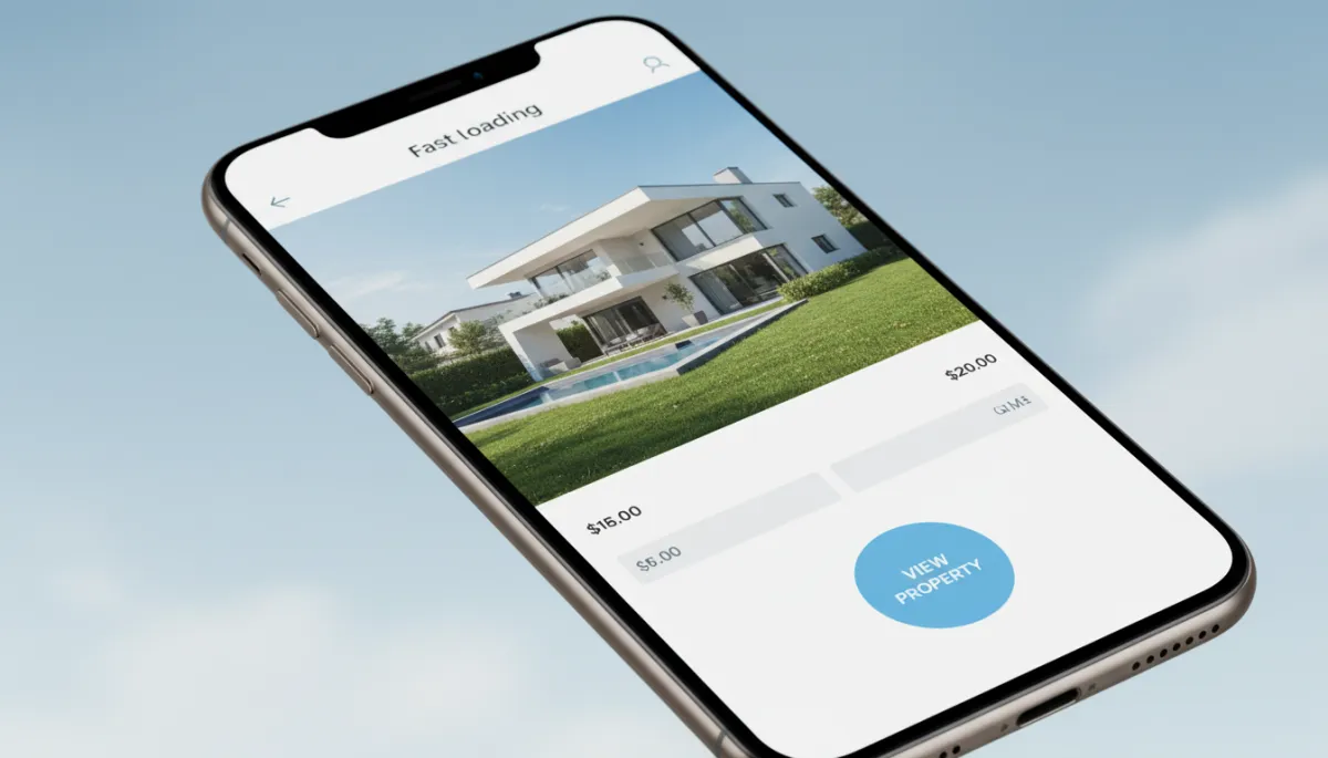
Fast, focused mobile pages keep paid traffic from bouncing before they see your offer.
5. One Generic Website Selling Every Project
A corporate site trying to sell five developments at once sells none of them well. Each project has its own buyer, its own story, and its own action, and forcing them through one generic template dilutes all of it. This is the case for project microsites, covered below, and it is one of the highest-leverage structural fixes available.
6. Nothing Happens After the Form
The quiet killer. A visitor finally submits the form, sees "Thank you, we will contact you soon," and the lead lands in an inbox someone checks tomorrow. Intent decays within hours. By the time a human replies, the buyer has inquired on two competing projects. No confirmation, no instant response, no next step booked means the site's one success still ends in a dead lead.
What a Converting Real Estate Page Looks Like
The pattern is simple, which makes its rarity stranger.
Above the fold, a clear value proposition: what this property or project is, where, and for whom, stated in the buyer's terms, with the starting price or payment plan hook if it is a strength. One primary action, visible without scrolling and repeated at natural decision points down the page.
Then visuals that make the opportunity tangible: renderings, real photography, floor plans, and virtual tours, because buyers commit to what they can picture, especially buyers who cannot visit. Proof close to the action: track record, delivered projects, testimonials from real buyers.
Then a low-friction capture step, and the part most sites skip entirely: an immediate automated response. Within a minute of submitting, the lead gets a text or WhatsApp message and an email acknowledging the specific project, delivering something useful like the floor plans or price list, and offering the next step, such as booking a call. Momentum is kept, not lost, and the follow-up system takes over from there.
Why Project Microsites Outperform Corporate Sites
For developers especially, the single highest-converting structure is a dedicated microsite per development: one project, one story, one action, on its own focused page.
Every element gets sharper because nothing competes. The messaging speaks to that project's buyer only. The visuals are that project only. The one call to action matches the project's stage, whether registering interest pre-launch or booking a viewing during sales. Paid campaigns get a clean destination that matches the ad, which improves both conversion and ad costs. And measurement becomes honest: you know exactly what that project's marketing produced.
The corporate site still has a job, credibility and the company story. But reservations are won on focused pages, not on brochures.
How Sayt Digital Builds for Conversion
Conversion-focused websites and project microsites are one of the four pillars of the buyer acquisition systems we build for developers and brokers, alongside the campaigns that feed them, the CRM automation that responds instantly, and the follow-up that turns inquiries into viewings and reservations. We build pages the way this article describes because we are accountable for what they produce: qualified inquiries, not page views.
If your site gets traffic but produces little, the audit is quick and usually conclusive. Book a consultation with Sayt Digital and we will walk through your current pages against exactly these six mistakes and show you what to fix first.
Frequently Asked Questions
Do I need a new website or can I fix my current one?
Usually you can fix the current one, at least as a first phase. Most conversion problems live in a handful of changes: one clear call to action, rewritten above-the-fold messaging, a shorter form, faster load, and automated follow-up on submissions. A rebuild only becomes the answer when the platform itself is too slow or rigid to allow those fixes.
What is a project microsite and do I need one for every development?
A project microsite is a small dedicated website for a single development, built around one story and one action, separate from your corporate site. For any project with its own sales targets and its own ad budget, yes, it deserves its own microsite, because focused pages convert better and make results measurable per project.
How fast should my website load?
Fast enough that a mobile visitor on an average connection sees meaningful content within about two to three seconds. Beyond that, abandonment climbs quickly, and paid traffic suffers most because those visitors have the least patience. Compressing images and renders is usually the single biggest quick win on real estate sites.
What should happen right after someone fills out a form?
Three things, automatically and within a minute: a confirmation on the page telling them what happens next, an instant text or WhatsApp and email that references the specific project and delivers something useful like floor plans or pricing, and a prompt to book a call or viewing. The lead should also land in a CRM that starts a follow-up sequence, not in an inbox.
Why do I get traffic but no inquiries?
Because traffic and conversion are separate problems, and yours is the second one. Visitors are arriving and finding no compelling reason or clear way to act: weak messaging, competing links, heavy forms, slow mobile load, or no urgency. Fix the page first, because every visitor you buy before fixing it is partly wasted.